The requirements for this year's A&S competition were as follows:
This year's challenge is to present something you have learned since Roses last year, that is completely new for you.
I want you to learn about something that is outside your current skillset, the greater removed the better. For example, I write Italian poetry and paint illuminations for scrolls. For this competition, I might go to Mistress Ose (or someone similar) and ask her to teach me nallbinding, or I might take a class at an event about how to make glass beads.
Along with a sample of your work, you must also provide a BRIEF (no more than 2 pages) writeup that documents what you have learned as period/relevant to the SCA, why you chose it as your new art or science of choice, and what the learning process was like (how did you learn about it - did you take a class, talk to a peer, read a book, etc? Was it hard to learn how to do? What specific examples of this new skill have you acquired? And so forth). Entries will be scored based on quality of work and documentation, with heavy consideration towards how new and different the subject is to you.
As you may know, I have recently taken up calligraphy. I decided to look a little deeper, and see what my duties would be if I won the competition:
To compete to be a Baronial Champion you must:
Consider yourself a Concordian, either by living within the geographic boundaries of the barony OR by identifying yourself as a Concordian through allegiance. Declare your intent to be a Baronial Champion at the tournament or by entering the competition.
A Baronial Champion is expected to:
Be willing to commit to the duties of the baronial champion, and must have no duties or fealties which would conflict with these duties. Attend the majority of Concordian events and participate in any Baronial Court held at those events. Attend the Baron and Baroness at some out of Barony events, including Pennsic if possible. Wear the regalia of your position. Organize next year’s Baronial Champion tourney/competition to choose your successor. Lead the Concordian units in battle if the Baron or Baroness is unable to do so.
Well ... I could do all that. I double-checked with Mistress Arianna, just to be sure the duties and requirements would not conflict with my Oath as her protege--she gave me the go-ahead, and I was off!
I decided to do a scroll blank for the East Kingdom's new AoA-level archery award, the Order of Apollo's Arrow. It went through several iterations before I settled on the final design.
I did not expect to win. I haven't been very active here in the East--indeed, most of the hundreds of people who were at Roses this weekend don't know me from Adam. In fact, Sunday morning I even debated not going back for the second day, because while the first day had been pleasant, the fact remained that I don't really know anyone and I expected to be rather lonely. Luke was having none of that! He came with me to the event on Sunday, sacrificing his sleep even though he had to work that night.
As court began Sunday evening, Their Excellencies called forth their current Champions and reclaimed the regalia to be passed on. Then They called forth Their new Heavy Champion, followed by Their new Rapier Champion. In each instance, I heard Them say to the person, "As we discussed earlier..." and then I knew for sure I hadn't won, because I had had no conversation with Them prior to court.
Which is why I was more than a little confused when They next called for "Shannon." I looked around--no one else was standing. Uncertainly, I got to my feet and asked, "Me?" to which there were many nods. Flustered, I scurried down out of the stands--thank goodness Luke was there to escort me, because I was a trifle unsteady!
Their Excellencies spoke about my entry and my documentation as I continued to stand there in complete shock. Before I really grasped what was happening, They were hanging a medallion around my neck and helping me slip into the blue and gold Champion baldric!

Her Excellency had said that it was my documentation which really made my entry stand out--She said She was really able to get a sense of the process I went through in learning my new art form. Here is that documentation:
Historic Basis
Artificial Uncial is directly descended from Uncial, which was the foremost script of the Church and therefore arguably the most important script from the fourth to sixth centuries. Artificial Uncial differs from its predecessor in that the nib of the pen is rotated horizontally. This pen position greatly increased the impact of letters by giving vertical strokes the full width of the nib while simultaneously creating the thinnest-possible horizontals. The technique first appeared in the sixth century, and gained full acceptance and recognition in the seventh.
As it gained in popularity, Artificial Uncial evolved from a speedy, functional script to an ever-increasingly embellished and intricate one. As its complexity grew, it became a script reserved for special works or for short, important points in longer texts.
The script fell out of favor and general usage by the tenth century, a victim of its own popularity and the resulting embellishment it endured.
Examples of Artificial Uncial can be found in such manuscripts as the Vespian Psalter, which was penned in England in the first quarter of the eighth century. Another example, also from England in the early eighth century, is the Rule of St. Benedict maunscript.
References
"Cotton MS Vespasian A I." Digitised Manuscripts. British Library. Web. 09 May 2016.
Drogin, Marc. Medieval Calligraphy, Its History and Technique. Montclair, NJ: Allanheld & Schram, 1980. Print.
"MS Hatton 48." Rule of St. Benedict. Bodleian Library, Oxford. Web. 27 May 2016.
Inspiration
and How I Made It
I
have wanted to learn calligraphy since 1996. Fourteen-year-old me had
a pen-pal in Norway who sent cards and letters embellished with the
most beautiful writing, and my own script--though neat and
legible--was rather drab in comparison. I ran out to the store and
bought calligraphy pens and a how-to book on "Old English"
lettering, but I very quickly became frustrated when the letters that
flowed from my nib were awkward and uneven rather than elegant and
beautiful.
Since then, I've dabbled around with my own handwriting, changing the way I form letters and practicing a "fancy" version. But I never really sat down and learned the mechanics and theories of calligraphy.
Fast-forward May 2, 2016. I was working the closing shift at work, and there was a five-hour gap between flights every night. I had been passing the time making Viking chains and fingerloop braid cords, but I began to itch for something different. Most of my leatherwork projects weren't even an option--the TSA gets a little jumpy if you bring things like Xacto knives to the airport. I thought about spinning wool, but decided that while it would keep my hands occupied, it wouldn't keep my mind busy. Then a friend at work suggested calligraphy, and it reawakened that old yearning from twenty years ago.
Somewhere along the way, I had already obtained a copy of Medieval Calligraphy: Its History and Technique by Marc Drogin. I stopped at Michael's on my way to work and picked up an assortment of calligraphy pens in various nib sizes, and also a pad of graph paper.
I
decided if I was going to do this, I was going to do it right. I read
all the instructions on how to hold the pen, how to angle the paper.
Medieval
Calligraphy has
a section on practicing pen strokes--I started with that.
It
took me a while to get the pen to glide smoothly and evenly through
the strokes--as I understand it, part of that difficulty is because I
am left-handed. I did an entire page of each basic stroke. Horizontal
lines in particular gave me fits, but I persevered.
It
didn't take long for me to grow REALLY bored with stroke practice.
So, in typical me fashion, I leaped on ahead to trying to master a
hand. I chose 'Artificial Uncial' simply because I thought it was
pretty. I really struggled with keeping the pen angle consistent, and
with the flicks and flourishes that begin or end so many strokes in
the letters. For several days I struggled to match the exemplar
exactly, and grew more and more disheartened as the texts I produced
continued to be legible but certainly not anything approaching
beautiful.
Then
as I sat down one day, about a week into this adventure, I decided to
reread some of the introduction and explanations in the book.
Something he wrote in his preface immediately grabbed the attention
of my frustrated mind:
I
think you will find, as I did, once you learn something of the
history of medieval scripts...
that
enormous creativity was involved in their birth and that you can
express as much
creativity
in working within them.
As
I continued reading, I noticed that Drogin emphasizes over and over
that basic alphabets existed, but individual scribes took liberties
within these forms and each calligrapher's hand was uniquely his own.
With that in mind, I began making minor adjustments to my problem
letters, trying to find a form that worked for me while maintaining
the proper feel of the overall script. I moved away
from the overly-embellished exemplars and worked with the simple,
base forms of the letters.
And
it clicked.
I
began producing pages upon pages of text that I was proud to say I
had written. I used the text from various award scrolls, song
lyrics, and even just random thoughts in my head, and I wrote. The
more I wrote, the more naturally the letters flowed. They became more
uniform in height. As I gained confidence, I began experimenting with
spacing and layout in hopes of someday actually producing scrolls for
Baronial and Kingdom awards.
For
my entry, I decided on the East Kingdom's new AoA-level award for
archery, the Order of Apollo's Arrow. Because the skill I am entering
for consideration is the calligraphy itself, I have not yet
illuminated the scroll (a daunting prospect in and of itself—I'm no
more experienced in illumination than I am in calligraphy). The idea
that it may someday hang proudly on a fellow archer's wall is
exhilarating and incredibly humbling.
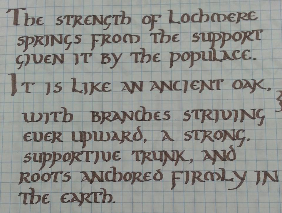
This
scroll is produced on 100lb vellum-finish Bristol using a Pigma
Calligrapher pen with a 1mm nib. I chose this pen because the nib is
hard plastic as opposed to felt, which better mimics writing with a
steel-nibbed pen. The blue capitals are lettered with a Recollections
calligraphy marker with a 2mm nib. I chose this pen for the capitals
after practicing both with it and with the ElegantWriter pen because
I find it writes more smoothly and provides crisper edges. I chose
blue to complement the colors of the badge.
The
layout of the text is intended to fit within a Celtic knotwork border
I developed as a rough draft for a baronial A&S award (included
for reference in the Appendix). The badge of the Order will be
rendered at the base of the scroll, below the signatures of the King
and Queen.
Along with the documentation, I included an Appendix which consisted of several of my practice pages, showing the progression of my lettering from day one to day twenty five.
I'm still in shock, I think.
I'll need to find out when EK court is at Pennsic, though, because I'll be attending Their Excellencies there, and at many events to come!
I want to thank Their Excellencies for the faith They have placed in me--I am humbled to stand behind Them as Their champion. I shall strive to bring honor to Concordia over the coming year, to grow my own skills as an artisan, and to encourage others to explore and fulfill their artistic passions and potential.
I want to thank Their Excellencies for the faith They have placed in me--I am humbled to stand behind Them as Their champion. I shall strive to bring honor to Concordia over the coming year, to grow my own skills as an artisan, and to encourage others to explore and fulfill their artistic passions and potential.