Since then, I've dabbled around with my own handwriting, changing the way I form letters and practicing a "fancy" version. But I never really sat down and learned the mechanics and theories of calligraphy.
Fast-forward May 2, 2016. I was working the closing shift at work, and there was a five-hour gap between flights every night. I had been passing the time making Viking chains and fingerloop braid cords, but I began to itch for something different. Most of my leatherwork projects weren't even an option--the TSA gets a little jumpy if you bring things like Xacto knives to the airport. I thought about spinning wool, but decided that while it would keep my hands occupied, it wouldn't keep my mind busy. Then a friend at work suggested calligraphy, and it reawakened that old yearning from twenty years ago.
Somewhere along the way, I had already obtained a copy of Medieval Calligraphy: Its History and Technique by Marc Drogin. I stopped at Michael's on my way to work and picked up an assortment of calligraphy pens in various nib sizes, and also a pad of graph paper.

It took me a while to get the pen to glide smoothly and evenly through the strokes--as I understand it, part of that difficulty is because I am left-handed. I did an entire page of each basic stroke. Horizontal lines in particular gave me fits, but I persevered.

I was rapidly becoming bored with this, even though I realized how important it was. In typical me fashion, I decided to forge on ahead and take a stab at one of the scripts in the book, "artifical uncial." I did two rows of each letter in the alphabet--including one 'A' that I was ridiculously proud of--and then ended my practice for the day with two words, which weren't particularly pretty, but at least were legible:


On a whim, I switched from the ElegantWriter pen to a Recollections pen with a 3.5mm nib. I was immediately a fan of this new pen--it flowed so much more smoothly! I repeated the stroke practice and the alphabet practice, and I was quite pleased with the results.
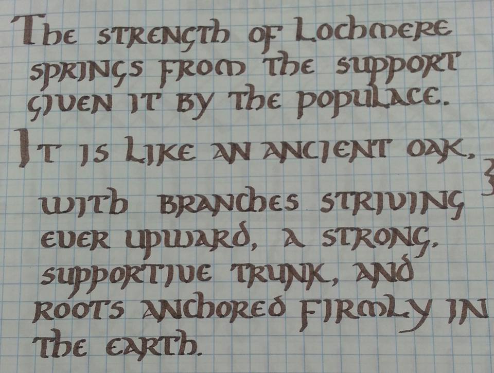
It wasn't beautiful or even very even, and I experimented with the line spacing (see "It is like an ancient oak" in the middle of the text). 'H' and 'Y' continued to be problematic--no matter how I tried, I just couldn't seem to get the pen to do what the exemplar looked like. I also added 'S' to the list of troublesome letters.
As I began day four, I remembered something that Marc Drogin wrote in his preface:
I think you will find, as I did, once you learn something of the history of medieval scripts...that enormous creativity was involved in their birth and that you can express as much creativity in working within them.

Working with an ElegantWriter 2mm nib, I returned again to the comfortably familiar text of the Blasted Oak, and played with 'G', 'Y', 'S', and even 'W'. I determined that I would use the serifed 'W' at the beginning of words, and my new 'W' in the middle of words. I began to develop a rhythm for the descender on 'G'. 'Y' remained a problem, though.
My overall lettering was much more even on day four--when I posted the photo on Facebook, I made the comment, "If it were on real paper instead of graph paper, I would not be ashamed to turn it into a scroll to be awarded to somebody." I think that really speaks volumes, coming from the girl who gave up on the dream of calligraphy for twenty years.

The text I used on day five is from the award for the Order of the Crab's Claw, also from the Barony of Lochmere. This text is longer--indeed, I ran out of room on the paper before I competed the text!
I did nail down my last two nemesis letters, and I was very, very pleased with the results.
So where do I go from here?
Well ... I have an idea or two. But you'll just have to wait and see!
No comments:
Post a Comment